In 2025, mobile devices drive over 59% of global web traffic. If your website isn’t optimized for mobile-first users, you risk losing potential customers, hurting SEO rankings, and lowering conversions. Mobile-first design is no longer optional—it’s essential for business growth. In this article, we’ll explore why mobile-first design matters, how it differs from responsive design, and the 5 benefits of mobile-first design for business growth.
Key Insights
Mobile-first indexing is Google’s standard for ranking websites in 2025 (Google Search Central).
Websites that load quickly and offer smooth mobile navigation see higher engagement and lower bounce rates (Tekrevol).
Mobile-first design improves conversion rates by providing a seamless user experience on smaller screens (MarketingProfs).
What Is Mobile-First Design
Mobile-first design is a web design approach that prioritizes the mobile user experience before designing for desktop. Traditionally, websites were designed for desktop first and then adapted for mobile. Mobile-first flips this approach, ensuring that content, navigation, and performance are optimized for smaller screens first, then scaled up for desktops.
Mobile-First vs Responsive Design
While responsive design ensures that a website adjusts to different screen sizes, it often starts with desktop as the primary view. Mobile-first design, however, starts with the mobile experience and adds enhancements for larger screens.
Key differences:
Focus: Mobile-first emphasizes mobile UX first; responsive emphasizes adaptability.
Performance: Mobile-first websites are lighter and faster on mobile.
SEO: Mobile-first design aligns with Google’s mobile-first indexing for better ranking.
Learn more in Elementor’s guide on responsive web design.
Why Your Business Needs a Mobile-First Website
A mobile-first website ensures your business can:
Reach the majority of users on mobile devices.
Improve Google search rankings with mobile-first indexing.
Reduce bounce rates with fast-loading, touch-friendly pages.
Boost engagement by offering a smooth, intuitive mobile experience.
Prepare your business for future technologies like PWAs, voice search, and 5G connectivity (BrandVM).
Without a mobile-first approach, businesses risk losing leads, hurting conversions, and falling behind competitors.
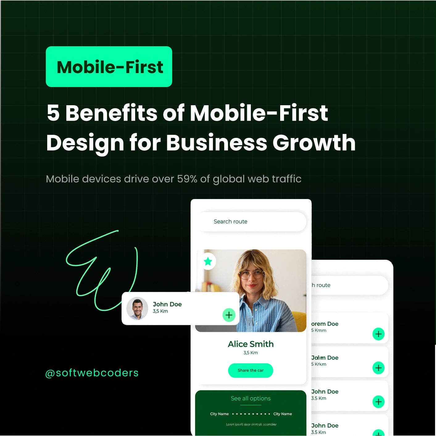
5 Benefits of Mobile-First Design for Business Growth
1. Improved User Experience
Mobile-first design focuses on simplified navigation, faster load times, and accessible content. Customers stay longer on your site, reducing bounce rates.
Suggested image: Mobile website UX mockup
Alt text: “Mobile-first website design improving user experience”
2. Higher Conversion Rates
A mobile-optimized website makes it easier for users to take action—fill forms, make purchases, or contact your business. Smooth mobile checkout can significantly increase sales and leads.
Suggested image: Mobile checkout flow
Alt text: “Mobile-first design increasing conversion rate”
3. Better SEO & Google Rankings
Google now uses mobile-first indexing as the standard. Websites optimized for mobile rank higher in search results (Google Search Central).
4. Faster Mobile Performance
Mobile-first design minimizes unnecessary code and uses optimized images and lightweight layouts. Faster websites = happier users + more conversions (Hostinger).
5. Future-Proofing Your Website
Mobile-first design prepares your business for emerging technologies such as progressive web apps (PWAs), 5G connectivity, and voice search. It ensures your website adapts to the evolving digital landscape.
Mobile-First SEO Best Practices for 2025
Optimize Core Web Vitals – speed, responsiveness, and stability.
Content Parity – mobile and desktop should have the same content.
Responsive Images & Lazy Loading – improve performance.
Touch-Friendly Buttons & Navigation – make your site usable on small screens.
Use Structured Data – FAQ or product schema for SEO visibility.
Common Mistakes Businesses Make When Ignoring Mobile-First
Designing primarily for desktop users.
Slow mobile load times.
Complex menus or buttons too small for touch.
Ignoring mobile SEO.
Not testing mobile UX on multiple devices.
How to Start (for Business Owners)
Audit your current site for mobile performance, load speed, and Core Web Vitals.
Plan a mobile-first redesign to optimize UX and conversions.
Hire a professional web design agency like Soft Web Coders to implement mobile-first principles.
Monitor metrics post-launch—traffic, bounce rates, engagement, and conversions.
Frequently Asked Questions
Q1: What is mobile-first indexing?
A1: Google uses the mobile version of your website for ranking and indexing, making mobile-first design essential for SEO.
Q2: Is mobile-first design better than responsive design?
A2: Mobile-first prioritizes mobile experience, which often leads to faster, simpler, and SEO-friendly websites compared to traditional responsive design.
Q3: Will mobile-first improve conversions?
A3: Yes! Mobile-first ensures smooth navigation and faster loading, which increases user engagement and conversions.
Q4: How do I test if my website is mobile-first ready?
A4: Use Google’s Mobile-Friendly Test to check mobile usability and loading performance.
Q5: Can a mobile-first redesign hurt desktop experience?
A5: No. Mobile-first design scales up for desktops, ensuring a seamless experience across all devices.
Build Conversion-Focused Mobile-First Websites with Soft Web Coders
A mobile-first website isn’t just a trend—it’s a necessity for business growth. At Soft Web Coders, we specialize in creating conversion-focused, SEO-optimized, mobile-first websites designed to increase traffic, engagement, and revenue. Contact us today to start your mobile-first journey.