CSS Clamp for Responsive Design allows typography to scale fluidly across all devices, ensuring consistent readability and a professional appearance. Implementing CSS Clamp for Responsive Design eliminates the limitations of static font sizes and reduces the need for multiple media queries, simplifying CSS management for designers.
What is CSS Clamp?
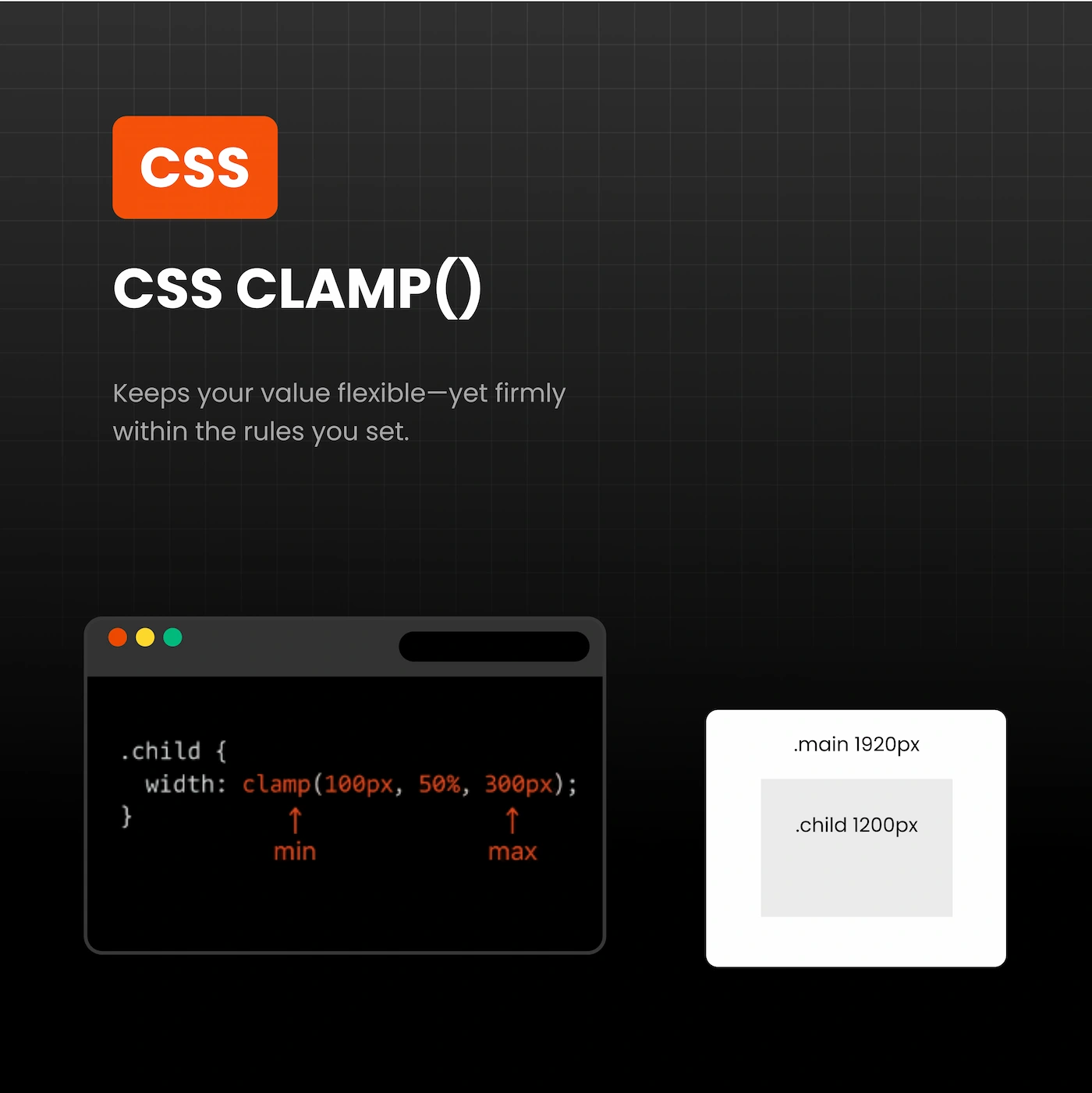
CSS clamp is a modern CSS function that defines minimum, preferred, and maximum values for a property, most commonly font size:
font-size: clamp(MIN, PREFERRED, MAX);
Where:
- MIN: Minimum font size for small screens
- PREFERRED: A dynamic value that scales with the viewport
- MAX: Maximum font size for large screens
Example of CSS Clamp for Responsive Design:
h1 {
  font-size: clamp(2rem, 3vw, 3rem);
}
On mobile, the heading never goes below 2rem, scales on medium screens, and caps at 3rem on large desktops. Using CSS Clamp for Responsive Design keeps typography fluid and visually balanced. For detailed documentation, visit MDN Web Docs.
Benefits of CSS Clamp for Responsive Design
Fluid Typography Across All Devices
Static font sizes often fail to maintain readability on different screens. CSS Clamp for Responsive Design ensures headings, subheadings, and paragraphs scale naturally, providing a consistent reading experience on smartphones, tablets, and desktops. For practical examples, see CSS-Tricks fluid typography guide.
Simplified CSS
Instead of multiple media queries:
/* Without clamp */
h1 { font-size: 48px; }
@media (max-width: 1024px) { h1 { font-size: 36px; } }
@media (max-width: 767px) { h1 { font-size: 28px; } }
With CSS Clamp for Responsive Design, the same effect is achieved in one line:
h1 { font-size: clamp(1.75rem, 4vw, 3rem); }
Professional and Predictable Typography
Using CSS Clamp for Responsive Design ensures text remains readable and proportional across all devices. This approach keeps headings, subheadings, and paragraphs visually balanced, maintaining a polished and professional look without extra code.
Future-Proof and Adaptive Design
Clamp automatically adapts to any screen size, making typography future-ready. As new devices and resolutions emerge, your font sizes remain consistent, eliminating the need for frequent adjustments.
Enhanced User Experience
Readable and scalable typography improves accessibility, visual hierarchy, and overall engagement. Implementing CSS Clamp for Responsive Design ensures users have a pleasant reading experience on all devices, reducing bounce rates and improving retention.
Practical Implementation
Desktop (Fluid)
h1 { font-size: clamp(2rem, 3vw, 3rem); }
h2 { font-size: clamp(1.75rem, 2.8vw, 2.5rem); }
p  { font-size: clamp(1rem, 1vw, 1.125rem); }
Tablet (Fixed)
@media (max-width: 1024px) {
  h1 { font-size: 2rem; }
  h2 { font-size: 1.75rem; }
  p  { font-size: 1rem; }
}
Mobile (Fixed)
@media (max-width: 767px) {
  h1 { font-size: 1.75rem; }
  h2 { font-size: 1.5rem; }
  p  { font-size: 0.9375rem; }
}
Best Practices
- Use fluid clamp() sizes for desktops and larger screens
- Use fixed rem sizes for tablets and mobiles when necessary
- Combine clamp() with rem-based spacing for margins and padding
- Test typography across devices to ensure readability
- Use natural internal links, e.g., contact our team for responsive web design services
Common Mistakes to Avoid
- Overusing clamp on mobile screens
- Neglecting line-height adjustments
- Using excessive viewport units that shrink text too much
- Applying clamp inconsistently across headings and paragraphs
Conclusion
Implementing CSS Clamp for Responsive Design ensures typography scales fluidly, remains readable, and maintains a professional appearance across all devices. This approach simplifies CSS, future-proofs typography, and improves the user experience. For flawless responsive typography, contact our team today.