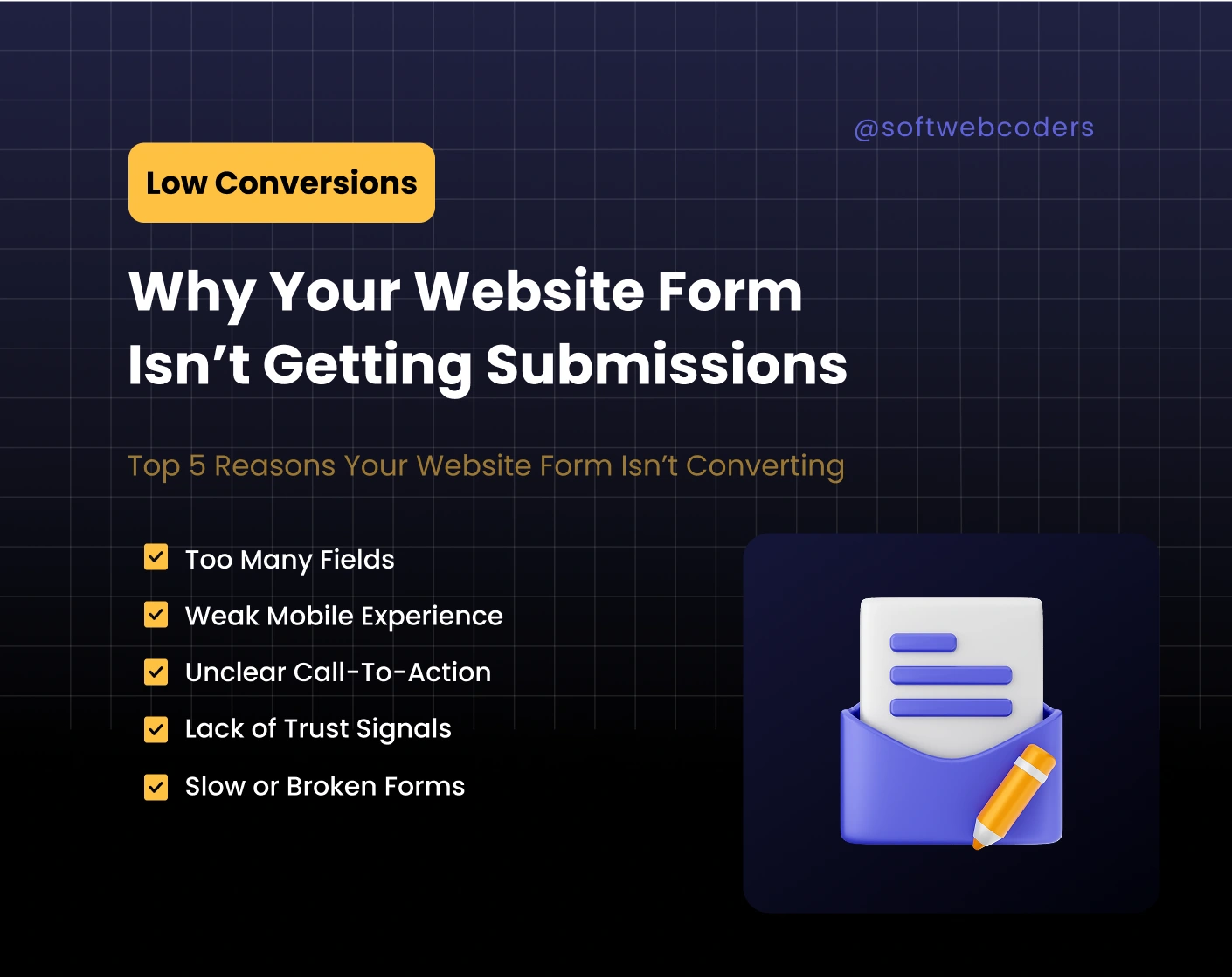
Your website form is one of the most critical tools in your marketing funnel. It’s the point where visitors convert into leads, turning casual interest into potential revenue. Yet, many websites fail to capture submissions effectively, even when traffic is high. The reasons are often subtle — from design and usability issues to technical glitches that silently block leads.
Understanding these challenges is the first step toward improving conversions and ensuring that your forms actually work for your business.
1. Asking Too Much Drives Visitors Away
Long, complex forms create friction and overwhelm users. Many businesses make the mistake of asking for too many details upfront, including:
- Company name, size, and address
- Multiple phone numbers or emails
- Detailed project descriptions
- Budget estimates
These fields can intimidate visitors or make the form feel like a chore. Studies show that every additional field can reduce conversions by 10–15%. Keeping the form focused on essentials — name, email, and a brief message — makes it approachable. Additional information can always be gathered later during follow-ups.
2. Mobile Experience Is Non-Negotiable
Over 70% of web traffic comes from mobile devices, yet many forms are still designed primarily for desktop. Common mobile problems include:
- Small input boxes that are difficult to tap
- Misaligned labels or confusing layouts
- Buttons that are too close together
- Forms that require excessive scrolling
Visitors won’t struggle to complete a form. Designing with mobile in mind means prioritizing readability, spacing, and ease of use. Even minor adjustments — like enlarging buttons or aligning labels properly — can increase submissions significantly.
3. Calls-to-Action Must Offer Clear Value
A generic “Submit” button rarely inspires action. Visitors need to know exactly what they’ll get after completing the form. High-converting CTAs communicate benefits clearly, such as:
- “Request Your Free Consultation”
- “Get Your Custom Quote”
- “Book a Strategy Call Today”
Pair your CTA with a short line explaining the next step, like “You’ll receive a detailed analysis within 24 hours.” Even small changes in wording, color, or placement can dramatically improve conversion rates.
4. Trust and Credibility Influence Decisions
Users are cautious when sharing personal information online. Forms lacking trust signals can decrease submissions drastically. Simple measures can make a difference:
- Include a short statement like “We never share your information”
- Use recognizable branding or SSL badges
- Link to a clear privacy policy
Trust isn’t just about security; it’s about confidence. Testimonials, case studies, or subtle branding near the form can reassure visitors and improve conversion rates.
5. Technical and Speed Issues Can Block Submissions
Even the best-designed forms fail if they don’t work. Hidden technical problems include:
- Broken validation rules that prevent submission
- Misconfigured email delivery
- Plugin conflicts or outdated scripts
- Slow-loading forms that frustrate visitors
Regular testing across devices and browsers ensures submissions reach you reliably. Optimizing page speed — compressing images, streamlining scripts, and using caching — also keeps users engaged and reduces abandonment.
6. Clarity and Context Reduce Friction
Visitors are more likely to complete a form when they understand what’s expected and why it matters. Clear field labels, short helper text, and context explaining the benefits of submitting make a huge difference. A simple note like “Get a free website analysis within 24 hours” clarifies value and increases trust.
7. Form Placement Matters
Even a well-designed form can underperform if it’s hard to find or lacks context. Placement affects whether visitors notice and engage with it:
- Place forms above the fold or in prominent sections of high-value pages
- Provide context that explains benefits
- Repeat the form strategically on long pages
8. Follow-Up Experience Converts Leads Into Opportunities
Many businesses overlook follow-up after form submission. Generic “Thank you” messages leave users uncertain about what happens next. Effective follow-up strategies include:
- Customized thank-you page confirming the submission
- Clear expectations for response times
- Automated emails that nurture leads
A strong follow-up process ensures that submissions turn into actionable opportunities rather than forgotten entries.
Forms are small elements on a website, but they play a major role in converting traffic into leads. By addressing usability, trust, mobile design, clarity, and technical performance, businesses can significantly improve submission rates.
If your forms aren’t performing, hiring professionals can save time and maximize results. SoftWebCoders specializes in optimizing forms and websites for conversion, ensuring that every lead has the best chance of turning into a customer.


